Pop-up modal

Pop-up modal

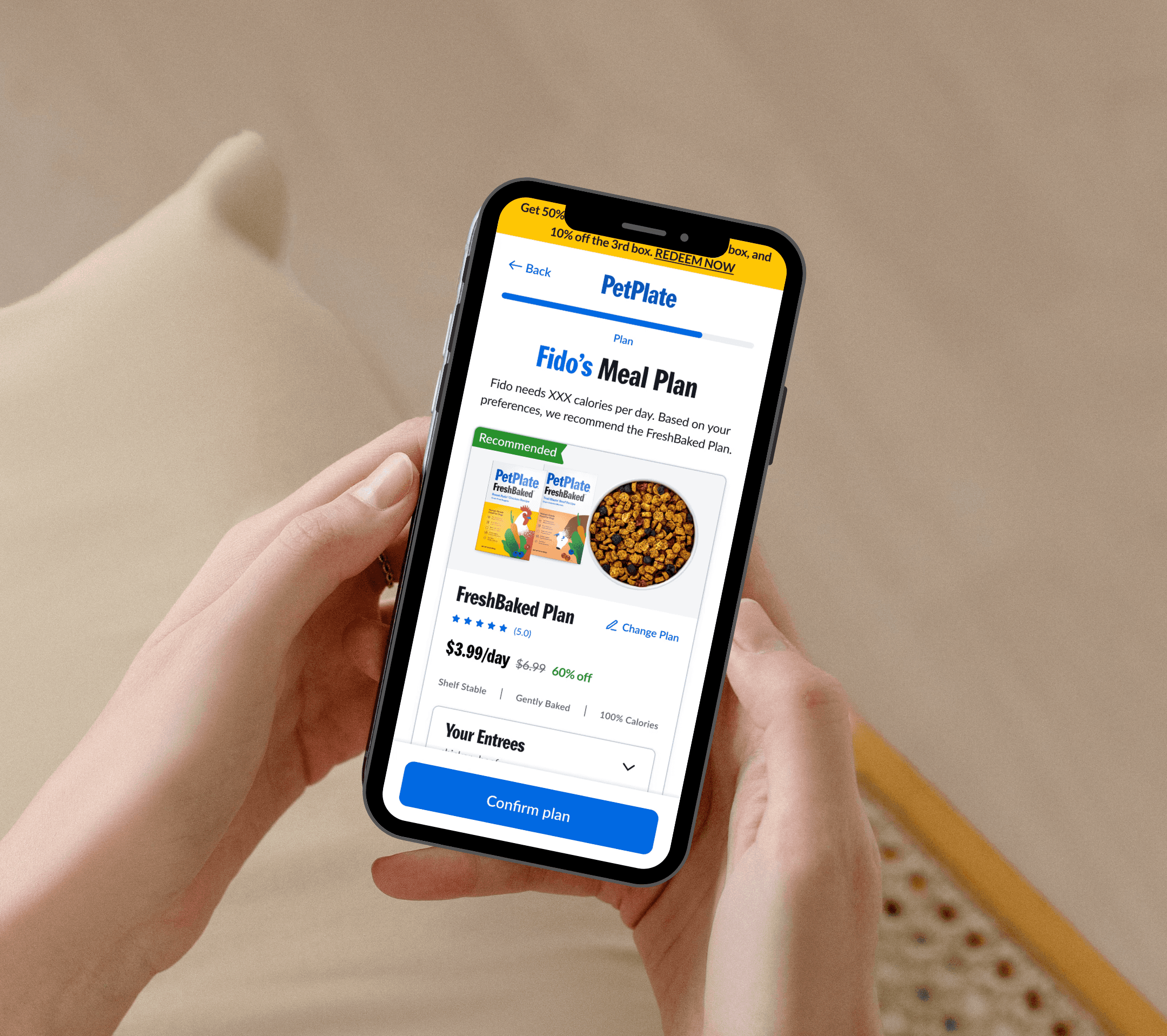
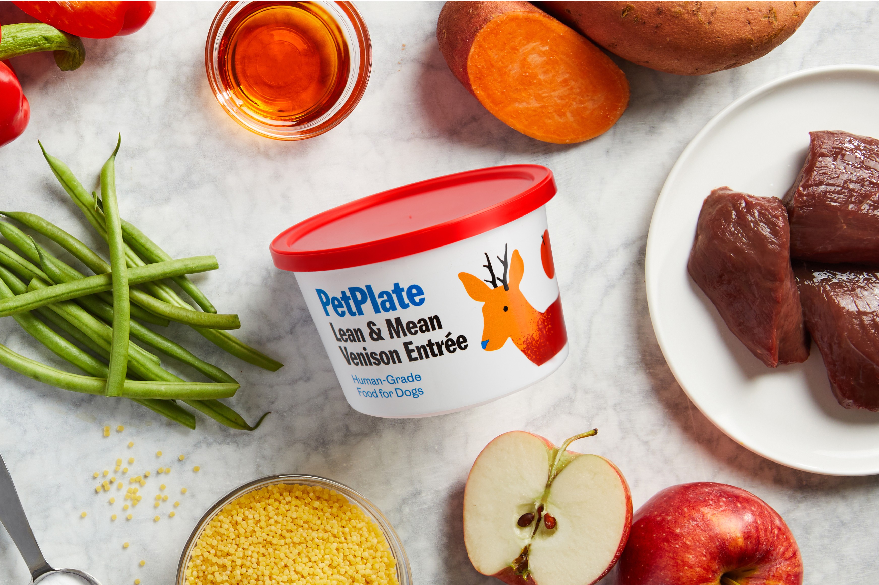
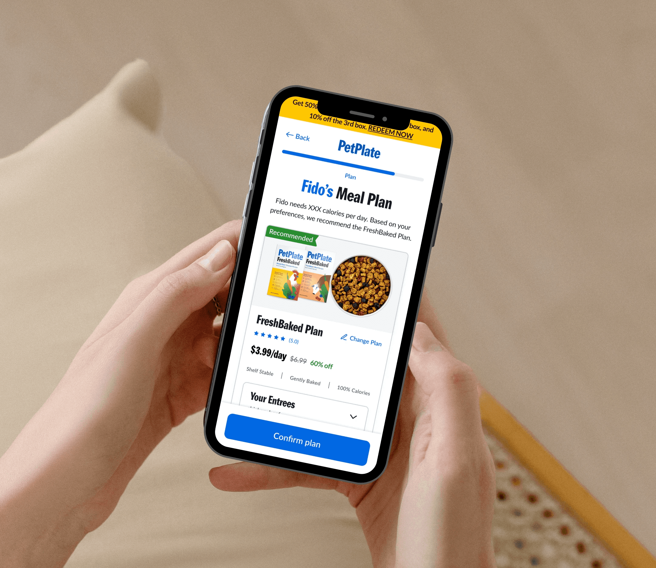
PetPlate is a premium dog food subscription service where users complete a questionnaire during the subscription flow to receive a personalized meal plan. Based on their answers, users are recommended one of four plans: FreshBaked, FreshCooked, FreshCombo, or Toppers.

Client

PetPlate

Role

Product Designer

Year

2025

*For an in-depth case study with my full UX process, please reach out :)

Results

Eradicated rage click instances.

Users' are able to learn about Entrees associated with each plan.

500+ users to subscription flow

Problem & Research

Problem & Research

Rage click instances

The "Prepared four way" module saw an alarming rate of rage clicks. Most notably, FreshBaked saw a top 3 clicks in the home page with over 700+ rage clicks alone month over month.

Hypothesis

Users' are curious about the plans we provide and want to learn more. Users' see the card style as an invitation to click

Q. How do we utilize the rage clicks to our benefits?

Analysis

Analysis

Analysis

Seeing Rage clicks in a positive light -> High engagement

We leveraged the existing engagement (rage clicks) as an opportunity to design around user behavior. Rather than replacing the modal, we transformed it into something users could actively interact with.

Qualitative Analysis

We conducted a series of user interviews to see what users want to learn more about each plan when clicked on.

Quantitative Analysis

Along with the user interviews we scanned the entrees pages to see what information users' most clicked on and interacted with the most.

Problem & Research

Problem & Research

Rage click instances

The "Prepared four way" module saw an alarming rate of rage clicks. Most notably, FreshBaked saw a top 3 clicks in the home page with over 700+ rage clicks alone month over month.

Hypothesis

Users' are curious about the plans we provide and want to learn more. Users' see the card style as an invitation to click

Q. How do we utilize the rage clicks to our benefits?

Prototype & Build

Pop-up modal

Based on user behavior insights, we designed an interactive pop-up modal that highlights the most requested information and most-clicked content from the entrées page. It now allows users to quickly see which entrées are included with each plan, along with other relevant details.

Entrees associated with plan

Pain Points

During interviews users noted confusion with entrees associated with each plan. "Barkin Beef" does not provide clear distinction whether it is a FreshCooked entree vs Freshbaked.

Solution: Clear UI that distinguishes entrees by plan.

Eradicated rage click instances.

Entrees "Learn more"

User Needs

Users noted that they would like more information on plans and entrees such as an ingredients list and differentiating factors.

Solution: Dropdown navigation that provides all key features, ingredients, and more.

Users' are able to learn about Entrees associated with each plan.

CTA -> Subscription Flow

Business goal

Each step included a clear CTA to guide users smoothly into the subscription flow.We wanted to make use of the rage clicks, so we created an interactive modal to redirect that engagement.

500+ users to subscription flow

Results

Eradicated rage click instances.

Users' are able to learn about Entrees associated with each plan.

500+ increase in users to subscription flow.

Prototype & Build

Pop-up modal

Based on user behavior insights, we designed an interactive pop-up modal that highlights the most requested information and most-clicked content from the entrées page. It now allows users to quickly see which entrées are included with each plan, along with other relevant details.

Entrees associated with plan

Pain Points

During interviews users noted confusion with entrees associated with each plan. "Barkin Beef" does not provide clear distinction whether it is a FreshCooked entree vs Freshbaked.

Solution: Clear UI that distinguishes entrees by plan.

Eradicated rage click instances.

Entrees "Learn more"

User Needs

Users noted that they would like more information on plans and entrees such as an ingredients list and differentiating factors.

Solution: Dropdown navigation that provides all key features, ingredients, and more.

Users' are able to learn about Entrees associated with each plan.

CTA -> Subscription Flow

Business goal

Each step included a clear CTA to guide users smoothly into the subscription flow.We wanted to make use of the rage clicks, so we created an interactive modal to redirect that engagement.

500+ users to subscription flow